
Oolo Marketing Services
Chiku
From Creative Energy to AI Intelligence
Project Overview
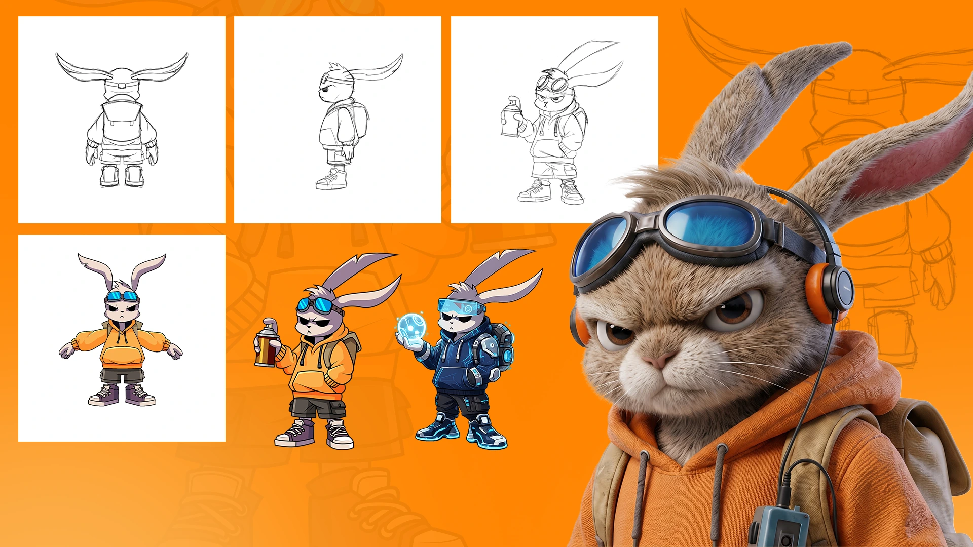
Every memorable brand needs a personality. A logo tells people who you are — a character shows people what you believe. When building the identity system for Oolo and Ennobler, we needed a character that could represent our unique approach: creativity powered by humans, growth accelerated by AI. That vision became Chiku — designed to show the journey from raw creative energy into intelligent innovation.
The Challenge: A Character That Evolves
The challenge was not simply creating a cute mascot. We needed a character that could represent two connected but different worlds — and show transformation between them, not just exist as a static illustration.
- Creative side — human imagination, design thinking, storytelling, experimentation, artistic expression
- Technology side — artificial intelligence, automation, optimization, digital transformation, future innovation
Orange Chiku — The Creative Intelligence
The concept started with a simple question: what does creativity look like before technology enhances it? This led to Orange Chiku. The graffiti-inspired style represents the raw creative process — the first sketch, the first idea, the first expression. Like an artist creating on a blank wall, Orange Chiku represents freedom, imagination, and human creativity.
- Creativity and curiosity
- Exploration and original thinking
- Brand storytelling
- Uncontrolled, experimental energy
Entering the AI Era: Creative Acceleration
During development, AI image generation was rapidly changing how designers explored visual concepts. Emerging tools like Nano Banana and Flux introduced new opportunities. Instead of using AI to replace the designer, we used AI as a creative accelerator — the human creates the identity, AI expands the exploration.
- Different visual styles and character variations
- Color direction exploration
- Rapid iteration and testing
- Future visual possibilities
Blue Chiku — The AI-Powered Evolution
The most important part of Chiku's story is the transformation. Orange Chiku does not disappear — the creative foundation remains. But the character evolves. The graffiti energy transforms into digital intelligence, representing our philosophy: creativity creates the foundation, technology creates the scale.
- Futuristic technology elements and digital energy
- AI-inspired visual details
- More precise, efficient, future-focused presence
- Enhanced capabilities without losing identity
The Transformation Visual Language
The color evolution tells the story. Orange represents creative energy, human imagination, ideas, and expression. Blue represents AI intelligence, optimization, technology, and growth. The transformation is not a change of identity — it is an upgrade of capability.
Building a Consistent Character System
One of the biggest challenges was maintaining consistency. AI can generate impressive visuals quickly, but building a recognizable character requires control. We needed Chiku to remain consistent across every application.
- Different poses, angles, and environments
- Character references and side elevations
- Multiple expressions
- Visual guidelines for brand applications
The Human + AI Creative Formula
This project represents our approach to modern creative development — the strongest result came from combining human creativity with AI capability.
- ✓Human creativity — character personality, emotional connection, brand meaning, visual direction
- ✓AI technology — faster exploration, more creative options, rapid testing, future scalability
Outcome
Chiku became more than a bunny character — it became a visual metaphor. Orange Chiku represents where ideas begin. Blue Chiku represents how ideas grow. Together they embody our belief: the future of branding is not choosing between creativity and technology, but building with both.
Have a similar project in mind?
Let's talk about how we can create a premium brand experience for you.